Revitalize Your Site with the Hottest Web Trends for 2015
If you want people to engage with your site then you need to make sure it’s packed to the brim with rich content.
But, these days, you need to be much more than a wizard with words to create a strong site.
What if your site’s design feels a little 1999? Are users really going to engage with a site featuring a dancing baby GIF?!
The answer is a big NO!
They’re going to want a site whose look is fresh and up to the minute, so here are my hottest web trends for 2015.
Different Device, Same Great Look

It’s always frustrating when you’re on the move and desperate for information, but that damn site you need hasn’t been optimized for mobile devices. You’re left swiping here, there and everywhere, but just can’t navigate easily.
And you know what? You’re not going to bother visiting it again.
With mobile browsing experiencing rampant growth, it means that site owners need a solution. Failure to address this issue means traffic and revenue will start to drop off.
To the relief of entrepreneurs, marketers and programmers, responsive design has provided the solution.
By using just one URL and a combo of flexible images and grid layouts, responsive design offers an answer. Visitors can throw any device they like at your site and it will still be displayed beautifully.
Responsive design has become very popular throughout 2014, so I believe the growth of mobile technology in 2015 means using this design is essential.
Scrolling Beats Clicking
Scrolling sites delve their hand into the Scrabble tiles and pull out F, U and N to create unique sites that you can’t resist exploring.

Sony’s amazing take on a vertical scrolling site
They’ve been designed with swiping in mind and not clicking, so it’s further proof that the digital world is being updated to satisfy mobile browsing needs – who wants to click 20 times to go through a site when you can do it with just one swipe?

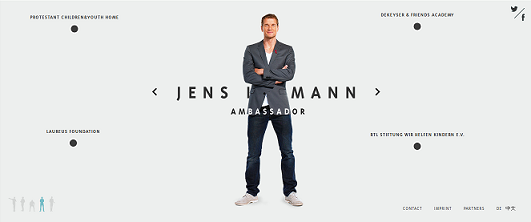
Excellent example of horizontal scrolling on Jens Lehmann’s site
Inventive designers are taking advantage of this demand and creating unique, cool and irresistible sites which use a number of different scrolling methods such as parallax, infinite and horizontal.
All these sites have one concept in common: simplicity.
Visitors don’t want to be bombarded with information, they just want quick access.
2015 will see these design trends becoming more and more common, so now is the time to have a look at your site and consider sprucing it up with an adventurous and appealing look.
Develop Microinteractions Which Don’t Infuriate
Engaging with your viewers is essential for a successful site. Fail to gain their interest and, next time, they’ll be typing your rivals URL.
How can you achieve this engagement? Sure, providing rich content is key, but how do you build a relationship with your users?
Pop up boxes have always offered a great opportunity to engage users and complete specific conversions e.g. sign up for a mailing list, but they can also be tacky and annoying.
It always grinds my gears when I’m reading an article and it’s suddenly blocked by a site request. On a mobile device it’s even more frustrating when you’re trying to click on a tiny ‘close’ button!
You need to take a step back from these intrusive pop ups. Instead, invest in plugins which create a more tolerable experience for the user.
Fulfill this need in 2015 and the traffic will be yours for the taking.
Bigger Is (Now) Better
Have you noticed how TV shows look amazing these days? The low cost of digital filming means that everything looks like a Hollywood production.
The internet is no different, but instead of recording mediums being cheaper, it’s bandwidth.

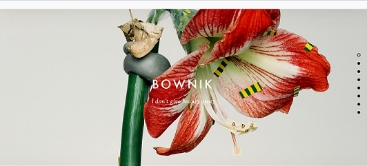
Thisispaper LOVES large images!
Huge, clear and crisp images can now be used to give your pages a majestic and alluring look with the added bonus of running lightning quick.
This trend is taking sites to a whole new artistic level and will really wow people throughout 2015.
Ghost Buttons
People like clicking buttons as they’re eager to see what happens. In the past we had to deal with clunky, grey buttons. They looked like something from a high school Visual Basic class. I was never impressed with them. Not even in 2000!
Things have moved on a fair bit since then and we’re now presented with ghost buttons.
There’s nothing spooky about ghost buttons although they are see through. However, they aren’t quite so hollow as there is a whole load of potential trapped inside them!

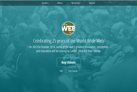
Ghost buttons can encourage you to convert and BUY TICKETS!
Ghost buttons fit seamlessly into any site’s theme, so they’re less ugly than the buttons of yore. They’re also fantastic at acting as headers which can draw people’s attention to certain sections of the page.
Did we mention that people love to click buttons? Oh, yes, we did! Well this means that ghost buttons act as awesome ‘call to action’ incentives which your viewers can’t help but take a chance on.
Peppering your site with these in the new year will only involve small aesthetic changes, but they may just help maximize your conversion rates.
Time to Get Redesigning to Meet the Web Trends in 2015
2015 is going to see the internet receiving a facelift, but this won’t be a disastrous nip and tuck. It’s going to see the internet become more engaging for its users.
More engagement means users will stay on your site for longer and the chances of conversion increase.
If you can match a fully optimized site with a fantastic, fresh look then you’re going to have no trouble selling it.


