

Avoid These 7 Absolutely Horrendous Web Design Mistakes
There’s nothing like visiting a damn slick website; the best ones are those where you can tell the publisher’s put blood, sweat and tears into their creation.
What do you do with these sites? You trust them, you give them your business and you come back for more.
However, what happens if you stumble across a lousy site packed full of irritating design flaws?
You hit the back button and try to erase the memory.
A highly accessible design, therefore, could be the difference between ensuring a constant revenue flow and having to take on a shift in McDonalds.
To help you avoid serving up fries, I’m going to take you through 7 of the biggest web design mistakes and how to avoid them.
1. Why Are You Blocking Your Content with Adverts?!
If there’s one aspect of browsing that absolutely makes my blood boil then it’s popup ads!
Imagine you’re trying to enjoy a nice relaxing beer at the bar, it’s one of life’s greatest pleasures. However, what if the barman suddenly started thrusting packs of peanuts in your face and demanding you buy them?
You’d get the hell out of there!
It’s no different with websites; people are there to read your no doubt amazing content, so let them do this.
Don’t fill the screen immediately with an obnoxious advert.
Leave a prominent ad at the end of the article if you have to, but seriously, give people some breathing space!
We’re sure your design assets are great, but we’re here for the content behind your damned advert!
2. What’s This Content Got to Do with Your Site?!
A constant flow of fresh, engaging content is vital to ensure your site brings in new traffic, but you need to make sure you stay on track.
The reason that people come back to your site time and time again is because they can relate to your content.
Throw something completely unrelated and alien in, though, and you’ll do two things:
- Make your regulars think “Am I on the right site? I didn’t come here for this!” and then leave!
- Bring in new traffic which couldn’t give two hoots about 99.9% of your site and won’t return!
It’s a bit like running a blog for several years about the fine wines of California and then, suddenly, throwing an article up on there about Kim Kardashian’s fashion tips.
Your average wine enthusiast will spit their Pinot noir out over their keyboard at this and head elsewhere.
Stay relevant to your users needs and keep your content focused!
3. What Do You Mean You Can’t Even Spell ‘Internet’?!
You’re looking for someone to provide you a great service, so you head online and find an amazing website.
These are the guys for the job. Just look how professional they are.
And then you spot it.
That terrible spelling mistake which stands out a mile.
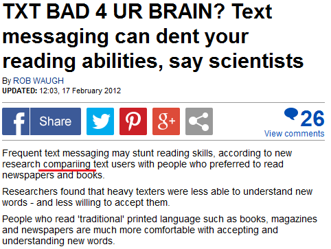
Epic spelling mistake by major British newspaper The Daily Mail
Are these guys really that amazing? Spelling mistakes, after all, should be the preserve of elementary school.
There’s no excuse in this day and age – or any age where the dictionary has existed – for poor grammar on your site.
It’s embarrassing and easily avoided if you invest in a proofreader; it’s a small cost to pay to keep your professional image intact.
In fact, 59% of Britons have admitted that bad grammar scares them away from websites, so check, check, check and check AGAIN!
4. What on Earth Is This Website About?!
The moment people hit your landing page they need to know EXACTLY what’s going on.
What are you trying to provide them with?
Where do they have to click?
Is it clear within seconds?
If people don’t know what’s going on then they’ll find somewhere else where there’s no uncertainty.
Make sure your landing page is in the shape of it’s life to take consumers deeper within the conversion funnel.
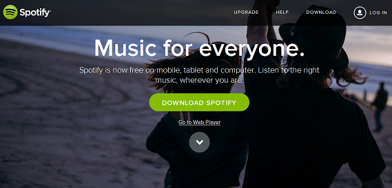
Spotify’s awesome landing page provides everything you need to know
5. How Am I Supposed to Find Anything on Here?!
People want to find the content they need as soon as possible.
The best way to help them is with simple navigation options such as:
- Stick to just one navigation bar – doesn’t matter if it’s horizontal or vertical, just keep your users’ eyes focused in one area.
- Keep your small print in the footer – no one’s going to head to your site and expect your small print to be displayed prominently in the header. We all know that the boring small print is at the end, so fill your footer up with terms and conditions, privacy policy etc.
- Put sidebars on the right – the majority of the Western world reads from left to right, so you want to keep your content on the left to ensure this is read first. Secondary information, housed in the sidebar, should go on the right.
Don’t disorientate viewers by trying to reinvent the wheel. Keep things intuitive and simple. Some things have remained the same since the early days of print for a reason!
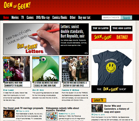
Den of Geek absolutely nail first class navigation
6. Where Did That Video Come From?!
Please, world, just stop it with those auto play videos!
There’s nothing more infuriating than reading through a great article and being ripped out of the moment by a video blaring out!
It’s even worse when your girlfriend’s sleeping next to you and is rudely awoken. It’s a hassle we can do without.
We actively avoid certain websites which pull this rotten trick and we can’t be the only ones.
To make your sites more user friendly try giving your users the choice of whether they play that video or not. It’s what the play button was invented for.
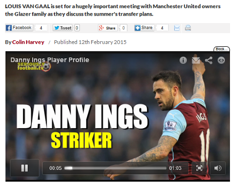
The Daily Star just love forcing loud videos on you to ruin their articles
7. What Am I Supposed to Be Doing on Here?!
When users visit your site they need to know almost immediately what they’re supposed to do.
The best way to keep their attention on track is by keeping things simple.
Look at Google’s homepage. There’s no confusion over what to do. You type in your search term – no more, no less. Anything fancy you need will come later.

You know exactly what you’re supposed to do on Google
However, if a site is a little bit cluttered it can get confusing to say the least.
Take a look at the monstrosity that is msn.com! There’s way, way, way too many options all vying for your attention – am I going to search, am I going to watch a video, am I going to Skype or just get a headache?!
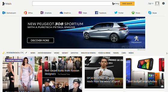
MSN provide too many disruptions on their homepage
Don’t try and overload your customers with everything at once. Streamline their focus and they’re more likely to end up where they need to go.
Get to Work Now!
There’s no time like the present, so grab hold of your website and, using my 7 tips, get it in shipshape order and reap the benefits!