

Surefire Ways to Maximize Landing Page Conversions
A great landing page can make or break your site’s ability to move visitors down the conversion funnel, but getting them to click that elusive call to action (CTA) is tricky.
If you want your site to succeed then it’s time to get your optimization cap on and maximize landing page conversions.
I’m going to show you the best ways to make sure your landing page leaves visitors unable to resist clicking your CTA.
Start off with a Great Headline
The first thing people are going to see on your site is the headline, so you want it to grab people’s attention.
Capture their imagination and it’s a surefire way to maximize conversion, so let’s look at the must haves of a good headline:
- A good headline will only be a sentence or two at the very most, so brevity is they key to keeping people intrigued (and awake).
- Likewise, keep the headline relevant to what you’re asking them to click. A lack of focus and a mismatched CTA will spell disaster for your conversion rates. People will get confused and look elsewhere for a simpler option.
- Finally, the headline has to tell people what the benefit of this CTA is.
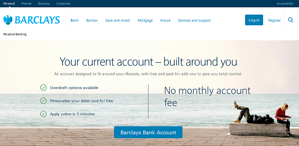
A good example of a killer headline is those banking giants, Barclays.
With a 6 word headline they get off to a great start by grabbing your attention quickly. Brevity? Check!
It’s pretty clear that the headline is talking about bank accounts as is the CTA. Relevant? Check!
The headline promises that a bank account with Barclays is flexible and built around you. Benefit? OH YES!
Make Your CTA Clearer Than Clear
You know how angry your Dad used to get when he saw you hadn’t tidied your room? That’s how I feel about sites full of clutter!
What am I supposed to be clicking on? That box up there? That box down there? What’s that picture all about? Can I click that?! Right, that’s it! No allowance this week!
Visually assaulting your visitors with info isn’t going to engage users. If they can’t find the relevant facts straight away they’re going to click elsewhere.
The best way to make sure this info can be found is to increase the white space. Less distractions mean more focus and more clicks.
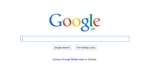
The kings of clutter free white space
Bullet Points Provide the Facts Quickly
Let’s face it, people are very busy these days and don’t have time to read an essay on why your CTA must be clicked.
A better way to engage and get the vital facts of your CTA across is via the humble bullet point.
By using 3 – 5 bullet points you’ll find that you’re able to convey all the essential info about your CTA. Users can then skim read your page, but still be aware of all the benefits of clicking.
Position these bullet points directly next to the CTA to keep the eye line where it needs to be.
Use Images Sparingly, but Cleverly
We’ve established that white space is essential to draw attention to your CTA, but you don’t need it to resemble a minimalist snow scene at the North Pole.
Images are more than welcome. In fact, they’re essential.
The old saying “A picture tells a thousand words” has never been more apt than on a landing page. The impact of an image is instant whereas text takes a little while to read. This means that the visitor’s eyes are drawn to the CTA much quicker.
You don’t want your website to resemble a trendy coffee table book, so keep images to a minimum. Instead, get a little creative and use the images as visual cues e.g. a person pointing in amazement towards your CTA.
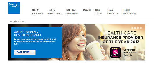
BUPA show how to draw eyes to their CTA with arrows and large visual clues close by
Go Fishing for Conversions with Tasty Bait
People love to feel as though they’re getting something for nothing. If they can reduce the time spent dipping in to their wallet then you’ll grab their attention.
Advertising free offers on your landing page is the number one way to draw people deeper into your site.
By offering an attractive initial CTA e.g. “Click Here To Save $10 On Your First Order” you coax users into the conversion funnel as they feel it’s worth it.
Marry this offer to a deadline e.g. “For The Next 3 Days Only!” to create a sense of urgency and maximize your conversion rate.
Keep Your Landing Page in Line With Your Ads
Don’t short change people by promising them the world with your ads and then giving them a two cent CTA.
If you promise someone “Great Discounts on Brand Name TVs” and then lead them to a signup page for a 12 month membership, they’re going to be peeved.
To make sure people don’t think you’re a fraudster you’re going to want the images and language of your ads to match that of your landing pages.
This is the best way to make sure people are clicking your CTA rather than the back button.
Change, Change and Change Again with A/B Testing
You might be starting to think that you’re becoming a master of landing pages now, but believe me, it’s not that simple!
It’s unlikely that you’ll perfect your landing pages first time. Just think about it, we’ve covered 6 areas and you need to make sure all 6 are perfect.
Many changes will be needed for all of these to work together harmoniously, so that’s where our old friend A/B testing comes in.
Try different headlines with different layouts with different offers etc.
Once you pinpoint the perfect combination you’ll really notice an increase in your conversion rate.
Brace Yourself For Impact!
I’ve covered some very important areas for you to optimize to get an amazing landing page. Just remember to keep you CTA clear, honest and attractive.