

All You Need to Know about Google’s Mobilegeddon Algorithm
Mobilegeddon is upon us, but don’t worry, you don’t need to sprint to that nuclear bunker in your backyard.
Instead, it’s time you embraced Google’s mobilegeddon algorithm as it’s going to define mobile search rankings.
And if someone’s performing a Google search you want to be at the top of their search results, right?
Great! Let’s take a look at what it’s all about!
What is Mobilegeddon?
Google’s new ‘mobile friendly’ algorithm is primed to deliver the best search results to your mobile.
There’s nothing worse than loading up a site on your mobile that you can’t view properly. You get angry, shut your browser and curse like a trucker fresh out of donuts.
And Google feels your pain!
That’s why they’re promising to soothe your rage with a mobile search engine results page (SERP) which won’t cause profanities.
Why Are Google Doing This Now?
Mobile devices have become very popular as mobile apps have become more and more powerful. In fact, according to a recent report by Comscore, we’re now at the point where mobile is the most popular digital platform.

Mobile’s rise to becoming the most dominant digital platform
That’s why Google want to upgrade their user experience by building this new behavior into their search results.
And, despite being the dominant search engine, it comes at a time when Google are looking to strengthen their position in relation to Bing and Yahoo. It’s, therefore, not something they’re taking lightly and you’d be well advised to keep up with it.
Is Your Site Mobile Friendly?
The world of mobile internet may be new to many site owners, so you’re probably wondering if your site satisfies Google’s new demands.
Luckily, Google are offering a quick and easy solution to answer your question.
You can now use Google’s ‘Mobile-Friendly Test’ to analyze whether your mobile site is up to scratch or needs more work.
If you take a look at SellMySite’s result you can see that we pass with flying colors!
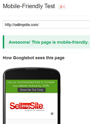
SellMySite is optimized for Google’s new algorithm
However, if there’s anything slightly wrong with your site’s mobile design then it won’t pass Google’s test.
Just to prove a point, let’s take a look at a really old site such as The Robert De Niro Page which hasn’t been updated since 1999! Now, mobile internet did kind of exist in 1999, but it was in it’s infancy as WAP and was very limited. We can’t say for sure, but we really doubt The Robert De Niro Page was optimized for mobile devices.
And, sure enough, it doesn’t pass Google’s test for all manner of reasons.
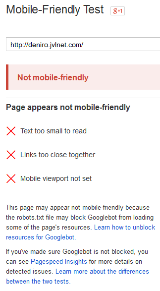
The Robert De Niro Page will not be near the top of the mobile SERP anytime soon
So How Do You Become More Mobile Friendly?
If you want to reach the top of the mobile SERP, then, you’re going to have to put on your optimization cap and get that site all singing and all dancing.
Let’s take a look at how you can turn your site from a digital waste ground to a mobile heaven.
Adopt Responsive Design. Using responsive design allows you to use the same design code on your mobile site as your desktop site. But get this: it displays it according to the device. Nothing is stretched or cluttered, instead it’s all displayed correctly.
Understand Mobile Keywords. Did you know that mobile keywords are very different to desktop keywords? Well, they sure are! Mobile users have an even more conversational way of searching, so you need to build this into your content. With these keywords in your arsenal there’ll be no stopping you in your race to the top of the mobile SERP.
Larger Text. Mobile screens may be getting bigger and bigger, but they’re still tiny next to a desktop screen. And that means that text which is legible on a desktop screen may leave you squinting on a mobile screen. Zooming in on a mobile device is always a hassle and it destroys any sense of scale. Make sure you use a large font size in scale with any images etc for your mobile site.
Make it Tappable. Flat design has allowed mobile devices to feel incredibly intuitive and navigating the web on them should be easier than ever. However, I still come across sites where buttons and links aren’t spaced properly. I think you’ll agree that being unable to tap on the link you want is enough to make your blood boil. So space them out!
Tailor the Technology Accordingly. If a device doesn’t offer, for example, Flash capabilities then don’t use it on your site. It’s that simple. You’ll find that you do nothing but frustrate your visitors if they’re served up with the dreaded “Flash is not supported on this device”. Instead, make sure your mobile site is accessible for as many people as possible.
The Future’s Mobile
Mobilegeddon is going to send shockwaves through the search industry. And you want to be at the forefront of mobile technology with a fully optimized site to rise up the mobile SERP.
If you follow our mobile SEO tips above you’re likely to deliver what Google is looking for. This type of mobile marketing will then allow you to deliver exactly what searchers are looking for.
And the increased traffic can only lead to more conversions.